
WAMID / CLIENT STORIES / BRAND IDENTITY
Organic OS
× WAMID
An authentic idea.
A recognisable system.
A visual identity for a content and media agency built around authenticity and a systematic approach. WAMID turned that idea into a language the brand can keep using.
Follow the story A brand idea, given a clear expression.
01 / THE BRAND IDEA
Content with character.
A brand with a clear point of view.
Organic OS connects the natural character of content with the discipline of a system. Its identity needed to hold both ideas together.
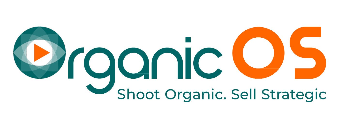
WAMID brought the name, brandmark, logotype and tagline into one direction. “Shoot Organic. Sell Strategic” expresses the agency’s proposition and gives the identity a clear verbal anchor.
A brand idea becomes more useful
when people can recognise it.
02 / THE VISUAL SYSTEM
A distinct character.
A common visual language.
The mark draws on the language of a lens, visibility and motion. Orange, teal and Montserrat typography give the identity a defined set of visual choices.
WAMID documented how those elements work together, including signature variations, spacing, proportions and colour applications. The result is a reference for making consistent design decisions.
Less reinvention in each new piece.
More continuity across the brand.
Character, with structure.
Shoot Organic.
Sell StrategicBrand tagline · Montserrat typography system
03 / BEYOND THE SIGNATURE
More than a logo.
A language to keep creating with.
The supporting graphic language extends the identity through repeated circular forms, lens and play inspired geometry, and the brand palette.
These elements give Organic OS more than a single signature to place on a page. They provide a consistent visual vocabulary for developing future communication.
Room to create,
with a recognisable thread.

04 / THE WAY FORWARD
A clear identity.
A system for the next expression.
WAMID delivered the identity and the guidelines that hold it together. The benefit is a shared visual reference: a way to develop new material while keeping the character of Organic OS in view.
Is your brand ready
for its next expression?
Talk to WAMID about turning a brand idea into a visual system people can use.